
The brief here is to shoot and present a series of photos in which we display and comment on histograms. The exercise is intended not "as an in-depth analysis" but to familiarize oneself with "the most basic characteristics of an image." In preparation I did a bit of research and reading on histograms, which I report on in a separate post here.
The exercise calls specifically for low, average, and high contrast images, each shot at normal exposure, plus one stop up and down for each, for a total of nine exposures. I decided to shoot these while also shooting for Exercise 2, about which you can read more here.
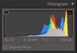
We are asked to comment on the relationship between the exposure and the data in the histogram, noting especially highlight and shadow clipping. I used exposure compensation to meet the requirement for multiple exposures (the RX100 does not feature auto-bracketing) which, as you can see, resulted in differing shutter speeds. I may wish to experiment with actual f-stops and see if it produces different results. My guess is that it will not.
We start with a series of high contrast images in which we find a notable difference between the light yellow-orange wall on the one hand, and the darkened windows and green shrubbery on the other. This is reflected in the histogram between the higher spikes rights, and the lower spikes left. There are more light tones in the photos and so the data spikes to the right are higher than those at the left. Notice that as exposure decreases, data begins to move to left, with the darker colors starting to increase in pixel count, resulting in taller spikes. Notice also that as exposure decreases, there is greater separation between green and red at the right. There appears to be minimal shadow clipping in the darkest exposure.
The live monochrome histogram on the RX100 would suggest that the slightly overexposed image is the better exposure, with more evenly distributed pixels. In fact I find the middle exposure has richer color and looks more as I remember it.


Next are a series of low contrast photos, images in which there are no deep darks nor hot lights. All the data is clustered toward the center. As exposure decreases, we observe in the histogram data shifting to the left, away from the lights and toward the darks, accompanied by a convergence of red and green. The middle photo appears to be the more attractive exposure.


Finding an image of average exposure seems problematic. All I have previewed have some highlights and some dark, similar to the first set above. So perhaps I should label that one as average and now display an image with extreme contrast. Here we notice the same shift to the left as exposure time is reduced (and less light touches the sensor). The slightly overexposed image shows minimal clipping of shadows, but none of highlights. Shadow clipping increases as exposure time decreases; concurrently, separation of red, green, and blue separate at the light end, while compressing at the dark end. The middle image is richer in detail on the distant skyscraper. In processing this image I reduced shadows slightly to bring out more details in the tress and did spot darkening at the base of the skyscraper. The result is produced below.


#
No comments:
Post a Comment