Yesterday my wife and I were out for a bit of shopping and
as we followed the directions suggested by my mother, we passed down a two-lane
road rolling through some beautifully manicured countryside, including a couple
of horse farms. We stopped at one where
the animals were out near the road to look and to take a few photos.
The purpose of this exercise is to discover how placement of the subject within the frame affects image composition. Three examples here show 1) the frame horizontal with subjects centered, then a pair vertical with the horizon line 2) high and 3) low. The convergence of the power lines and the fence provide pleasing perspective and symmetry in 3, where the theoretical meeting point is about the center of the image. The effect is less appealing where the horizon line is high, and where the warp of the fence at bottom distorts the line’s symmetry. In the horizontal image the large patch of grass forms a dead zone that makes the image list towards bottom left.
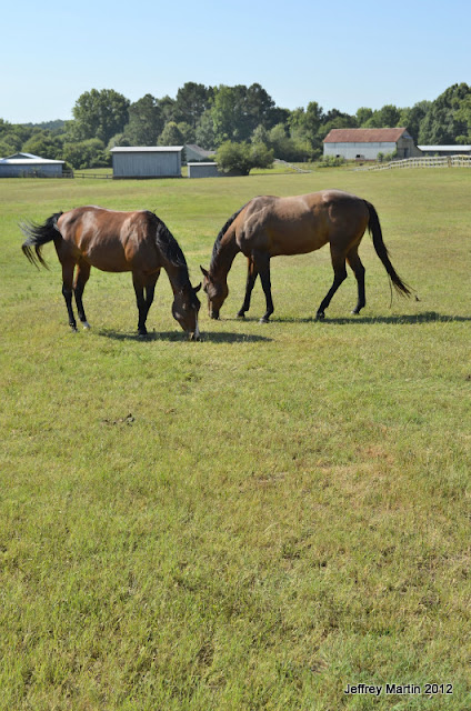
Another set of images show the horses in the middle of their field. Four examples are shown here: 1) from the road with horses framed center inside their fence, 2) the horses centered at a tighter focal length, 3) the horses in the bottom left of the frame, 4) at bottom right, and finally 5) centered in a vertical composition. The first photo’s deep perspective creates an image in which the horses are just one of many elements: a rolling field bounded by a fence (which also creates a pleasing frame-within-a-frame effect), a farm house in the distance, a viewer in foreground. In the close-up, the horses are clearly the subject of the photos, their positions creating a nice bit of symmetry, the farm houses in the background providing supporting elements of the story. Of the two photos with the horses off-center, that with the horses right works better with the left-frame light source, giving the image a more balanced feel. The vertical image also has pleasing symmetrical subjects, but the large bit of foreground pulls the eye down and makes me feel like I’m falling into the photo.
A final set of images focuses on the farm house. The first photo was shot at a wide focal length, the house occupying the frame’s top right, the field of grass rolling out before it. The second shot has the house in the same position but at a longer focal length and with a smaller field. The third image was taken vertically at the same focal length and shows a larger swatch of grass foreground, and the final image is again at the same focal length but with the house centered vertically and horizontally within the frame. In the first image the eye starts at the house but quickly sinks into the grass. The same effect is evident in the vertical shot. The more appealing photos are the second and fourth.
#


Hi Jeff,
ReplyDeleteSome great images.
My favourites are 2 and 4 from the final set, (maybe as they conform roughly to the rule of thirds).
In 4, the farmhouse is possibly too central, but as the exercise is all about objects in different positions within the frame, I guess that explains it!
Barry